Guardian and readers contributions
 I had a spring in my step as I made my way to the newsagent yesterday morning. And of course after all that its astonishingly fine.The size of G2 is a bit ridiculous, a bit Russian Doll as one of my colleagues neatly put it but apart from that its a brave and innovative leap as that one 17 years
  ago when David Hillmans astonishingly clean, modern whitespaced design was introduced. I loved it. Dan has the best and most comprehensive design commentary.
What i picked up on straightaway though were the further improvements its introduced (in print) to try and incorporate the contributions of its readers/users and open up the paper. And at the same time further blur the dividing lines between the paper and Guardian Unlimited. Online the Guardian is obviously comfortable in this area with the (astonishing) new editors blog (which has already shown its worth as a tool to reflect user feeling/brand response conversation in the reinstatement of the Doonesbury cartoon strip) building on the work of Rafael Behr over at The Observer.
 Emily Bell has also used the reformatting to announce a couple of new social software products including a collaborative annotation travel guide thing; Been There
where I've already been questioning Simon Hoggarts views, no less, on Brighton's fish and chip shops. He should have talked to his colleague Matthew Fort who like me knows that th
 e only chippie worth mentioning on the south coast is this.. But I digress.
Up til now the lynchpins of reader participation, ownership and accountability (in print) had been the paper's Ombudsman Ian Mayes and his weekly column (Previously on Saturdays and now moved to Mondays) alongside the first and finest (and witty) Corrections and Clarifications column in UK newspapers. And increasingly letters pages had started to proliferate in every one of (society, education, life/it) G2 sections and supplements but now look. This sort of participation is happening all over the shop...
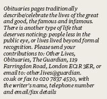
The high profile and explicit call to action on page 2 of the paper for feedback about the design "Whatdoyouthink@guardian.co.uk?", is obvious enough but a new innovation is the, er democratisation of the obituary pages, which originally I envisaged was to be merely annotations of the great and good but has (3 days in) evolved into a fascinating reader led space documenting what they are calling "other lives" and has so far amongst others featured a dedicated mother/cleaner/socialist/anglican worshipper,
an archaeologist, and a TV producer in admidst the actors, politicians, and sportsmen.
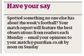
Now The Observer has done a pretty good job of acknowledging the role of zines in amidst its sports coverage with regular zine editor contributors but now the Guardian has started to tip a nod in this direction with some "citizen" match reports. And yesterdays Education supplement was stuffed full of this sort of stuff with 4 examples of copy being driven entirely via readers (emailed) submissions.
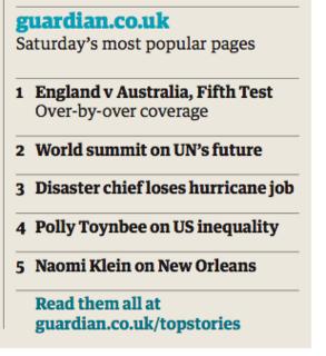
Finally they've taken a step further, as far as possible, the relationship with online. Upselling to Unlimited and the digital edition is difficult to get right editorially and in print (all those URLs) but it still feels pretty seamless and not too intrusive and, there again, the most prominent web print feature is again user led; a blog review and a most popular pages chart.
This is groundbreaking stuff (for UK papers at least) though and The Guardian, again, is leading the way in dare I say it having a conversation (that old chestnut) with its readers both in print and online. (and now on TV too.) Markets are conversations after all. Now will that translate into er, revenue. Those £80m printing presses and dicey circulation figures are heavy baggage to carry about for much longer.


0 Comments:
Post a Comment
<< Home